Build a basic Modal Component with React and Styled Components
Posted by Wesley on 2019-11-7
This is a basic modal component built with React and Styled Components.
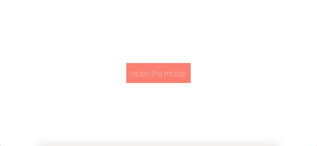
Once the button is clicked...
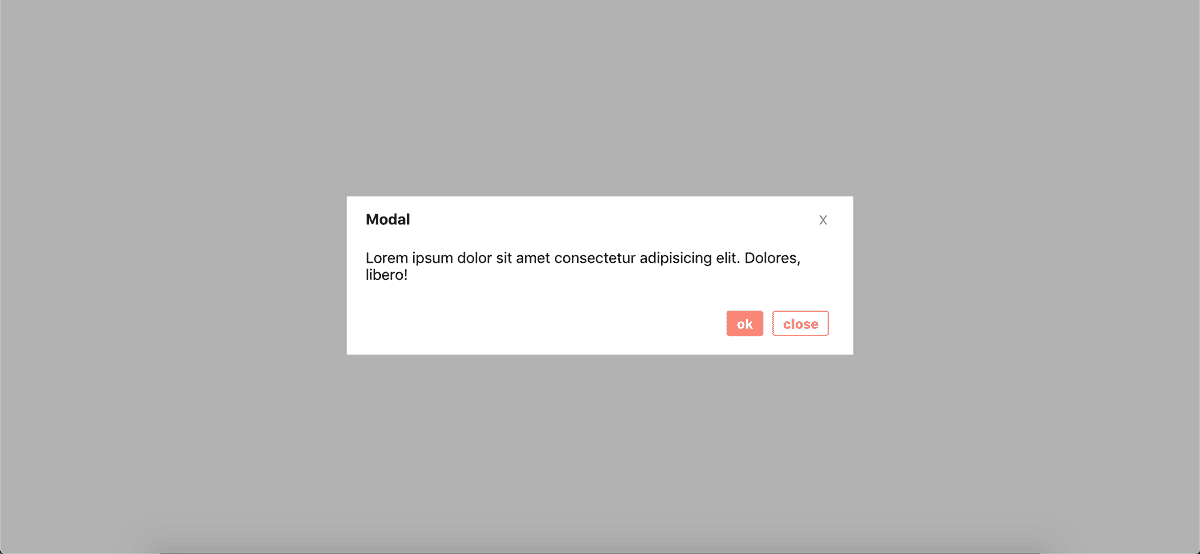
... the modal is opened.
Here's the App.js.
This modal uses state to determine whether the open property is true or false. The click handlers take an event (in this case, the users mouse click) as an argument and set the state accordingly.
The button that opens the modal has an onClick handler that sets the state of the modal from false to true, thus from closed to open.
The props isClosed and isOpen are passed down from here to the child component (Modal.js).
import React, { Component } from "react";
import Modal from "./Modal";
import styled from "styled-components";

const Btn = styled.button`
  margin: 0 auto;
  position: fixed;
  left: 50%;
  top: 50%;
  transform: translate(-50%, -50%);
  padding: 20px;
  background-color: salmon;
  border: none;
  color: white;
  font-size: 35px;
  font-weight: 100;
`;

class App extends Component {
  state = {
    isOpen: false
  };

  open = e => {
    this.setState({
      isOpen: true
    });
  };

  close = e => {
    this.setState({
      isOpen: false
    });
  };

  render() {
    return (
      <div className="App">
        <Btn onClick={this.open}>open the modal</Btn>
        <Modal isOpen={this.state.isOpen} isClosed={this.close}></Modal>
      </div>
    );
  }
}

export default App;
Here's the Modal.js, with all of the nice styles.
The "x", "ok", and "close" buttons all close the modal, and thus all accept the isClosed prop that is passed down from the parent component, App.js.
All of the styles are defined at the top.
import React, { Component } from "react";
import styled from "styled-components";

const Div = styled.div`
  width: 500px;
  max-width: 100%;
  background-color: white;
  margin: 0 auto;
  position: fixed;
  left: 50%;
  top: 50%;
  transform: translate(-50%, -50%);
  padding: 10px 20px 40px;
  display: flex;
  flex-direction: column;
`;

const Button = styled.button`
  margin-left: 85%;
  border: none;
  font-size: 14px;
  color: gray;
`;

const Backdrop = styled.div`
  position: fixed;
  top: 0;
  bottom: 0;
  left: 0;
  right: 0;
  background-color: rgba(0, 0, 0, 0.3);
`;

const Tag = styled.h4`
  margin-top: 1%;
`;

const Btns = styled.div`
  margin-left: 76%;
  display: flex;
  margin-top: 5%;
  margin-bottom: -5%;

  & button {
    margin: 5px;
    font-weight: 800;
    font-size: 14px;
    border-radius: 8%;
    padding: 4px 10px;
  }

  & .ok {
    background-color: salmon;
    color: white;
    border: 1px solid salmon;
  }

  & .close {
    color: salmon;
    border: 1px solid salmon;
  }
`;

export default class Modal extends Component {
  render() {
    let modal = (
      <Backdrop>
        <Div>
          <Tag>
            Modal <Button onClick={this.props.isClosed}>X</Button>
          </Tag>
          <div>
            Lorem ipsum dolor sit amet consectetur adipisicing elit. Dolores,
            libero!
          </div>
          <Btns>
            {" "}
            <button onClick={this.props.isClosed} className="ok">
              ok
            </button>
            <button onClick={this.props.isClosed} className="close">
              close
            </button>
          </Btns>
        </Div>
      </Backdrop>
    );

    // if isOpen is false, don't display the modal

    if (!this.props.isOpen) {
      modal = null;
    }

    // otherwise, return the modal component

    return <div>{modal}</div>;
  }
}
This project could be further refactored, but I decided to break it into smaller pieces for the sake of simplicity.
Thanks for reading!

